





The jewellery was good. The visuals weren't keeping up.
Monster Piercing's homepage banners, social posts, ad creatives, and email assets all felt a step behind the product quality. The design work wasn't bad, but it wasn't working hard enough — especially on mobile where most of their traffic lands.
This is what we did and how it went.
What wasn't working across Monster Piercing's channels
Same two problems, every channel.
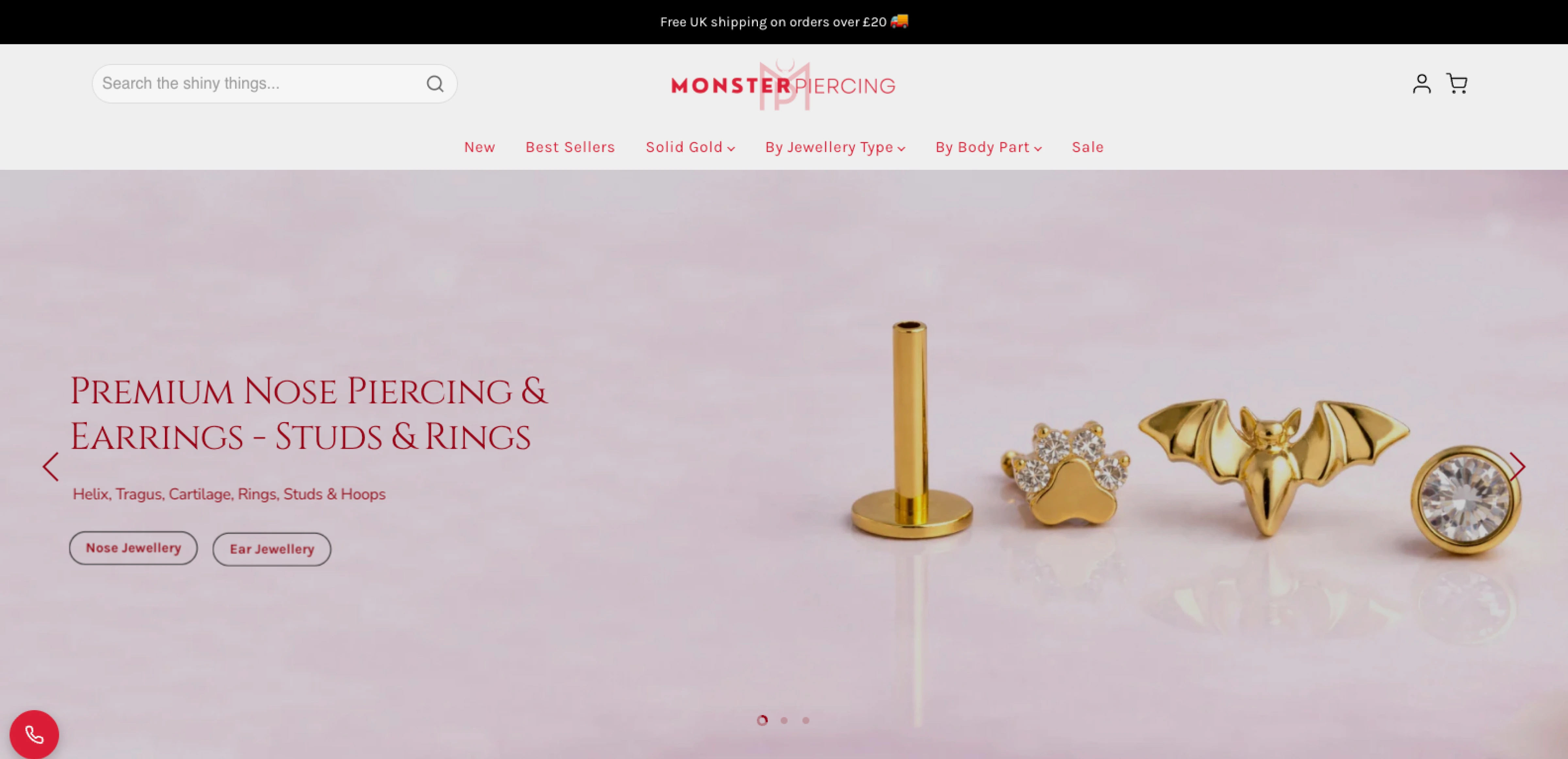
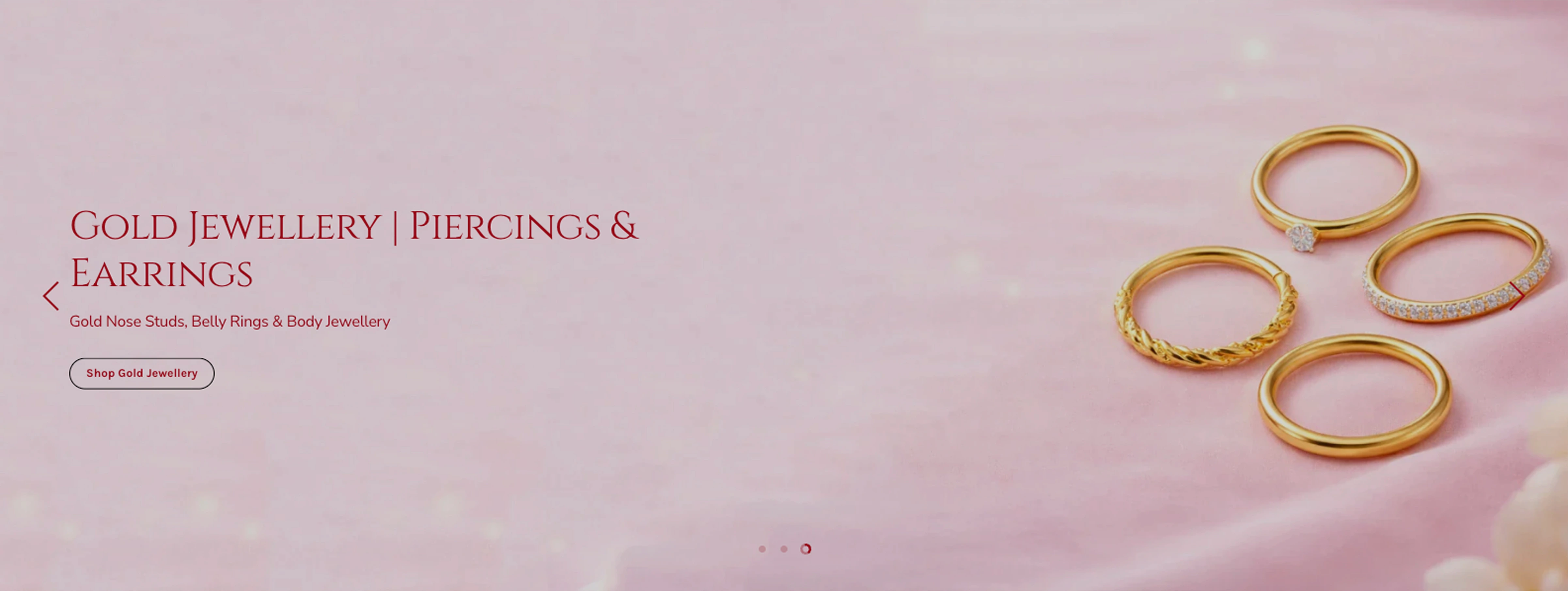
The homepage hero banners existed, but they weren't guiding anyone toward products or collections. You'd land on the site and the first impression was... fine. Not bad, not compelling. The design didn't reflect the quality of what Monster Piercing actually sells.
Then there was social and paid. Posts and Meta ads didn't have enough visual weight to compete in a feed. Layout was flat, product focus was weak, hierarchy wasn't doing anything useful.
Rebuilding the homepage banners
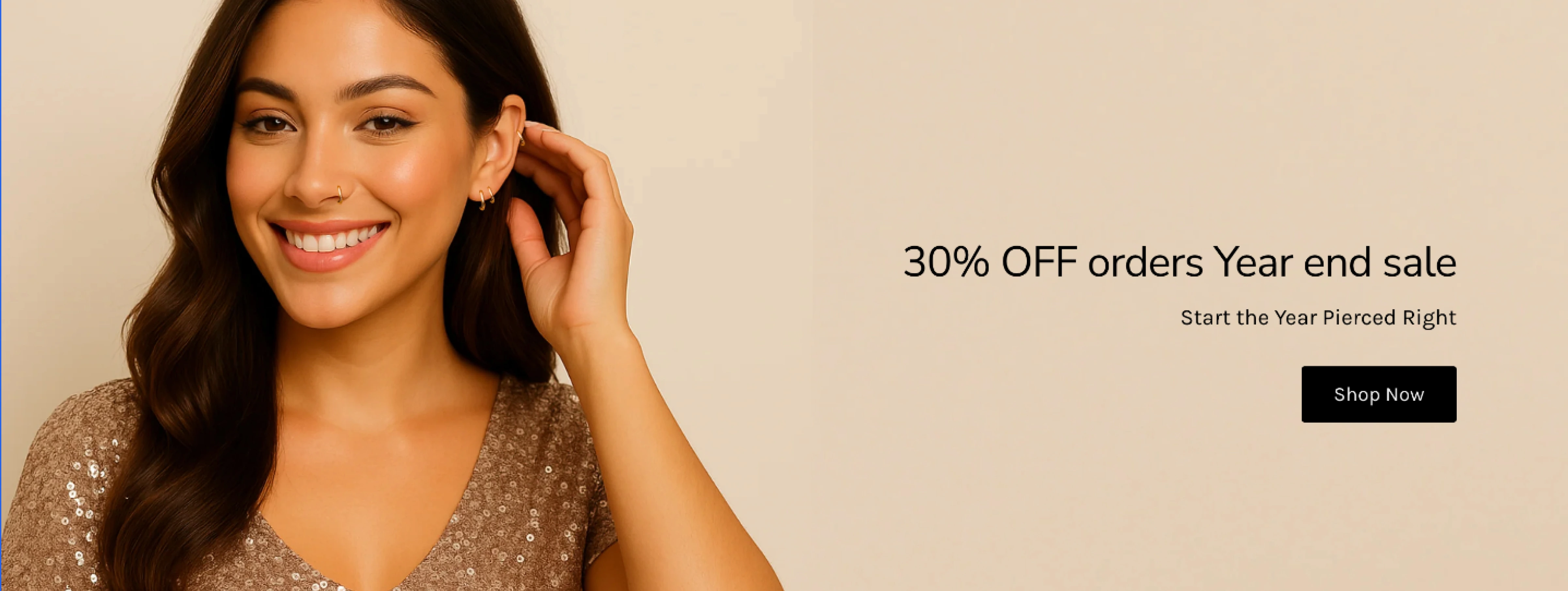
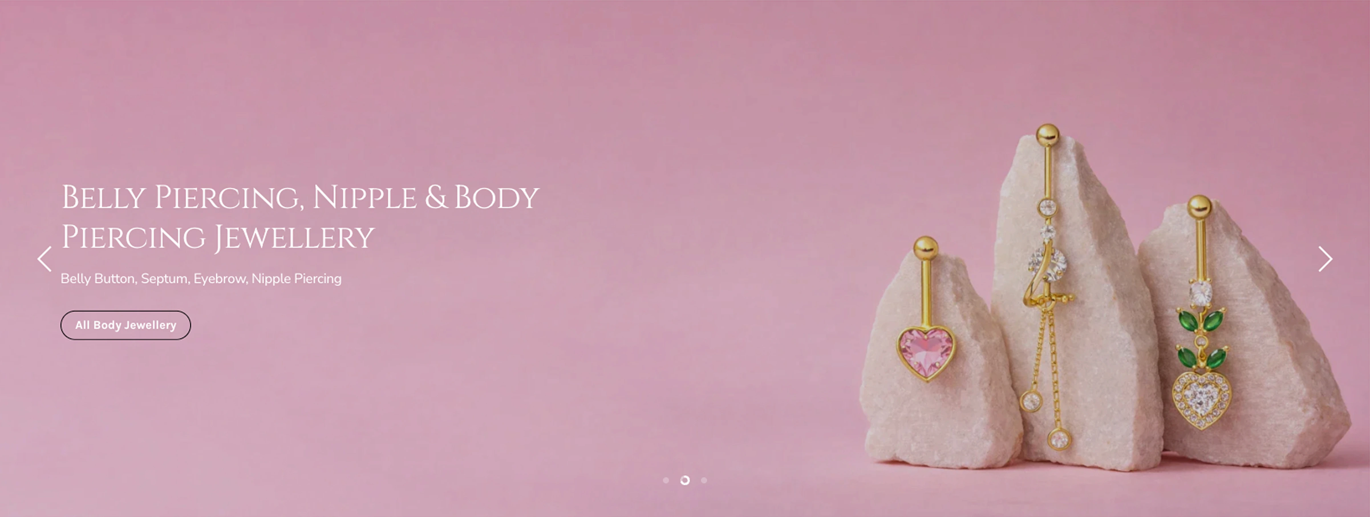
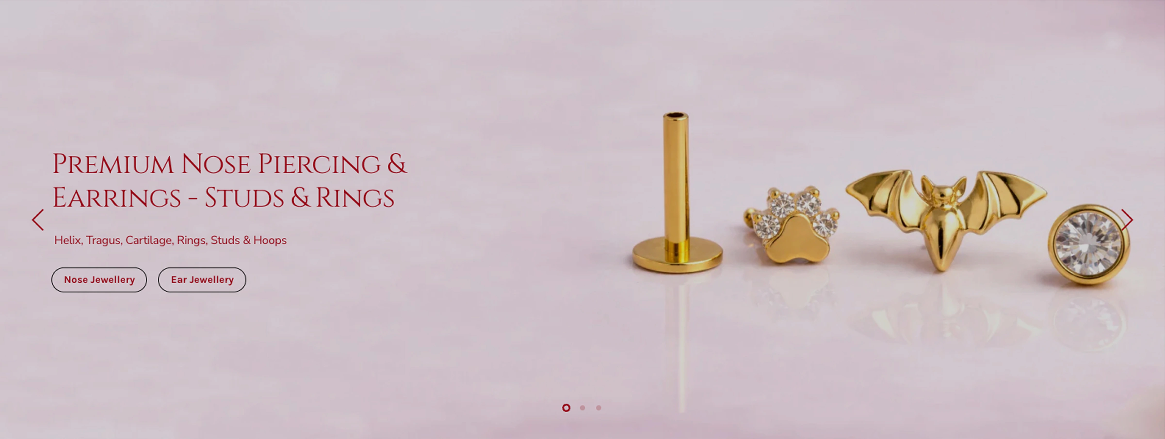
We gutted the hero banners and started from what mattered: making the product the first thing you see.
The first round of concepts actually underperformed in internal review. They looked polished but the layouts were prioritising aesthetics over clarity. People's eyes weren't landing on the jewellery. We stripped it back, put the product where it needed to be, and cut anything that got in the way.
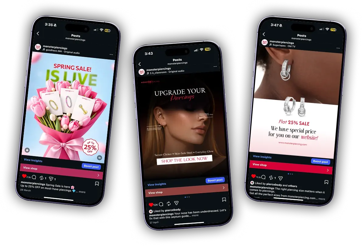
Social creatives for piercing jewellery
We went back to basics on the social creative: if the product isn't the first thing you see, the post isn't doing its job.
Layout, colour grading, and text placement all got reworked. The goal was posts that work as standalone product shots, not just branded tiles people scroll past.
Social creatives Twelve redesigned posts across three campaign sets. Same product-first system applied throughout.
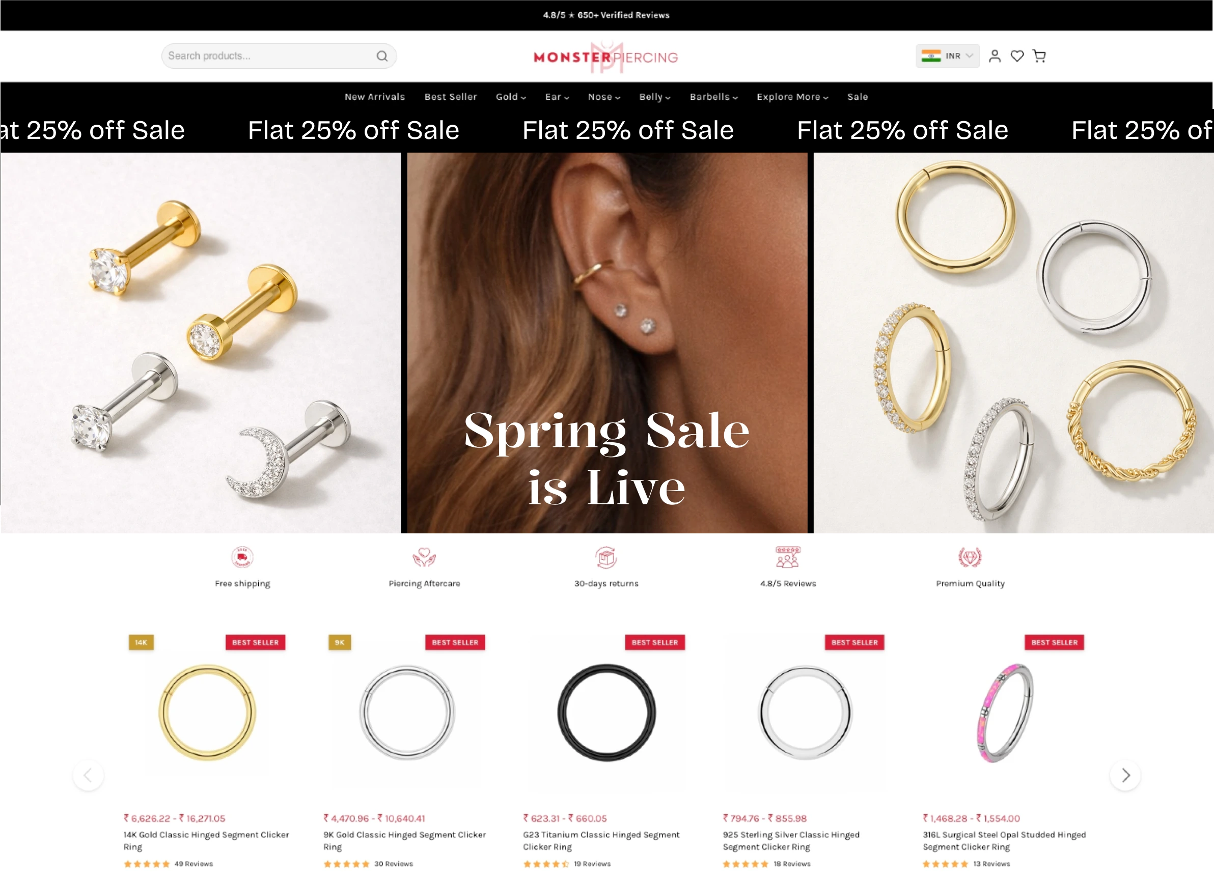
Easter and Valentine's campaign
Seasonal campaigns are tricky for jewellery. Lean too hard on the theme and you bury the product. Go too subtle and it doesn't feel like a campaign at all.
The early Easter concepts had exactly that problem. Too much pastel, not enough piercing jewellery. We went through three rounds before landing on versions that kept the seasonal framing in the background and the product up front where it belongs.
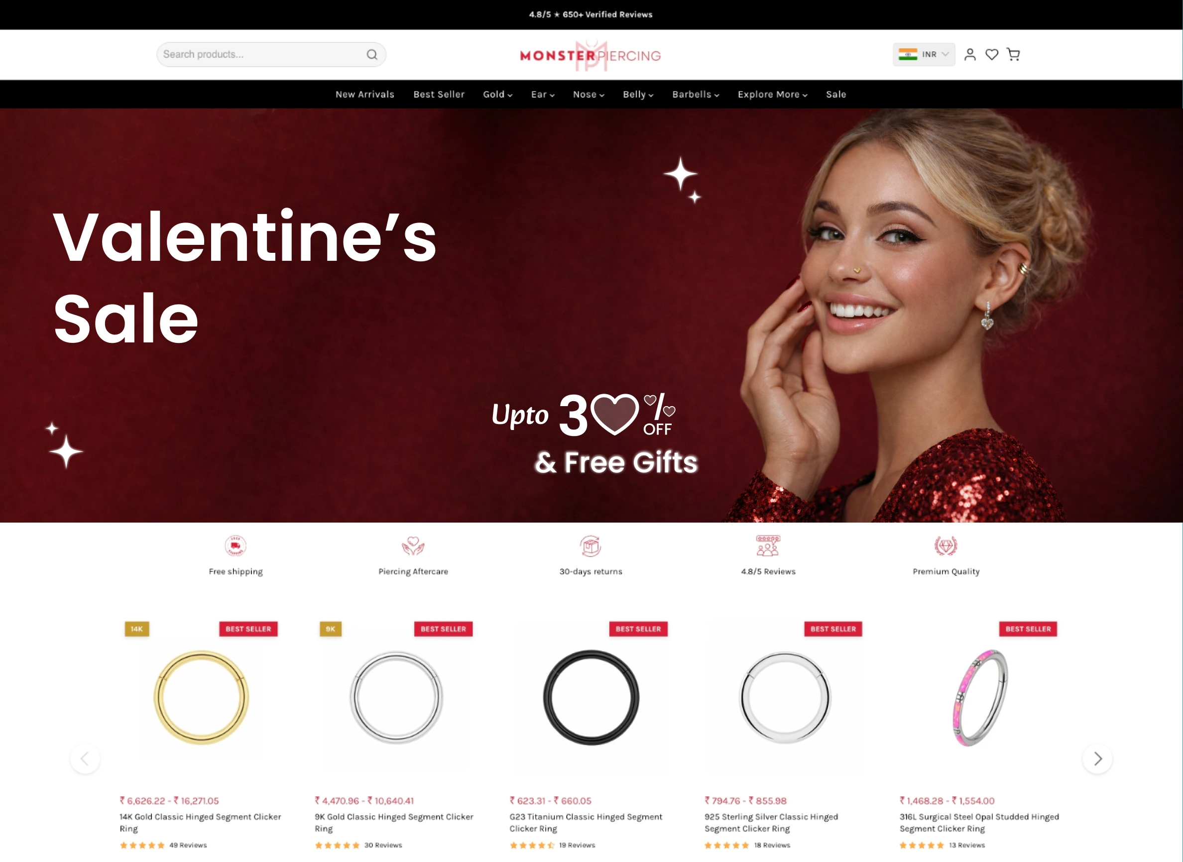
Valentine's had a different challenge. The jewellery naturally fits a gift purchase, but the visuals needed to feel like the occasion without looking like every other pink-and-red ad in the feed. We paired romantic styling with Monster Piercing's sharper brand character, keeping the product centre-frame as the gift itself rather than a prop inside a lifestyle shot.
Meta ads
We rebuilt the Meta ad set with one constraint: one product or collection per frame, nothing competing with it.
The previous creatives were trying to do too much in a single image. Simplifying that made the biggest difference.
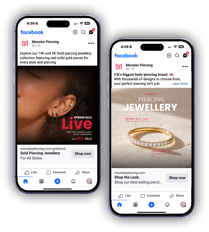
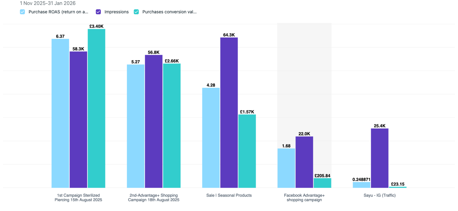
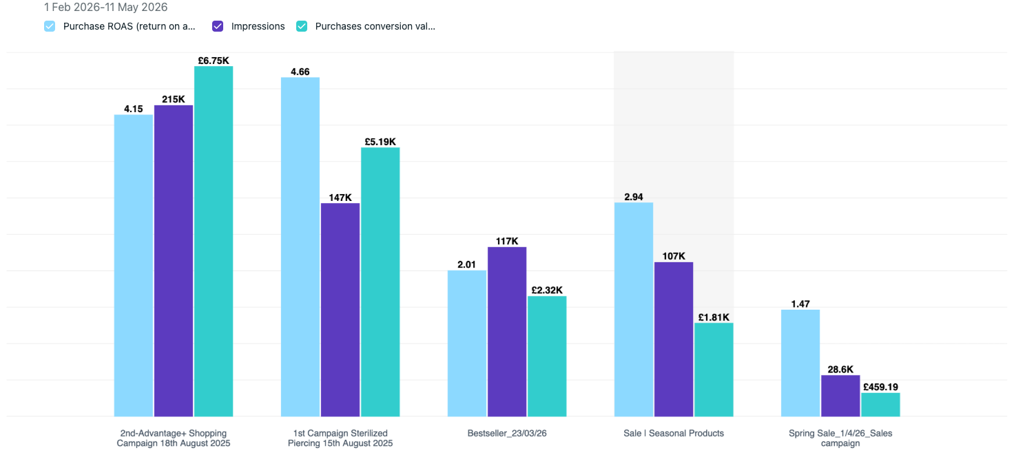
This is the same approach we take across all Meta ads management for ecommerce work — fewer elements, stronger product focus, cleaner hierarchy.
Email banners and icons
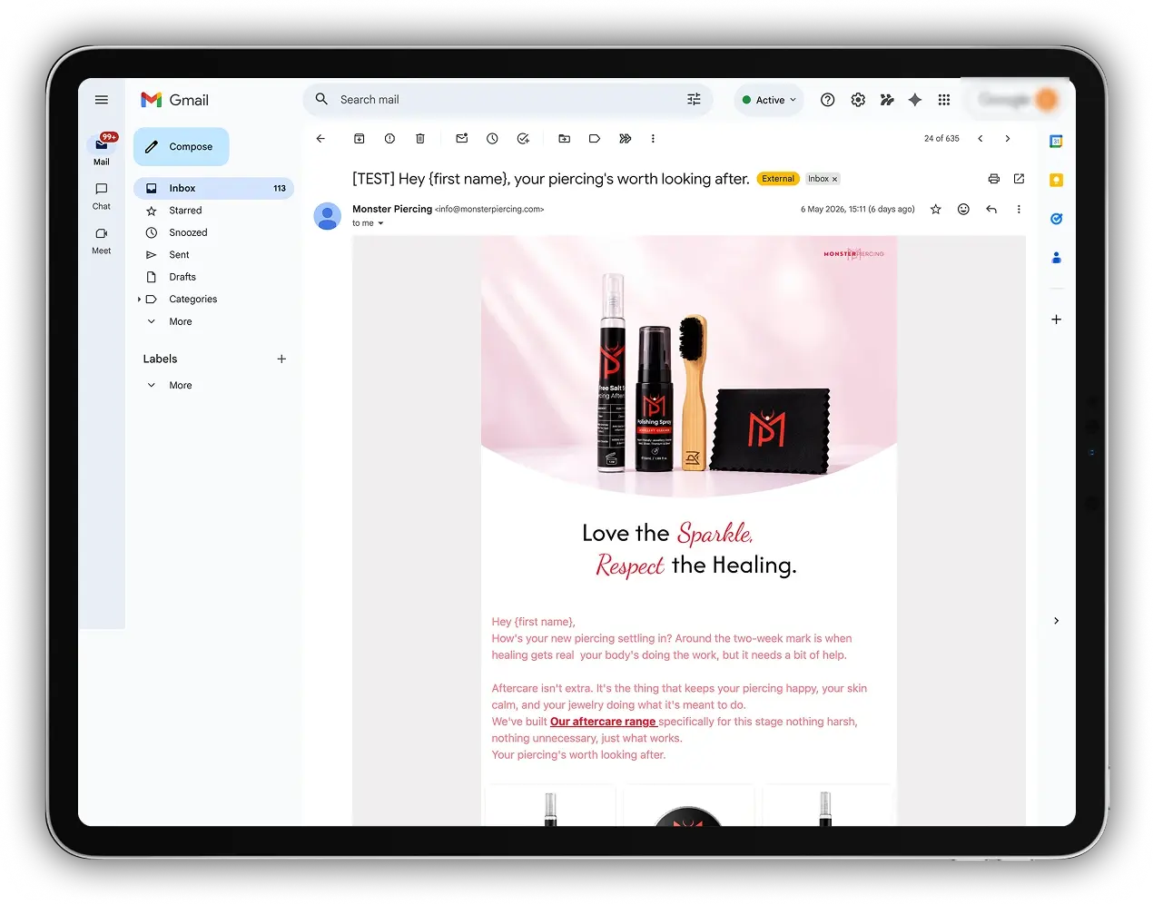
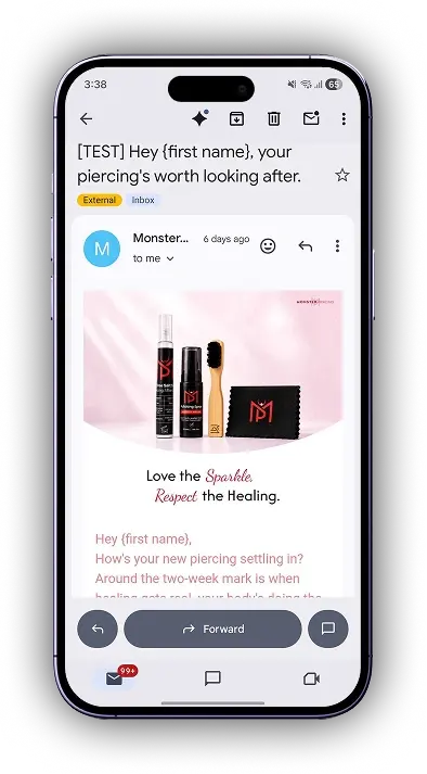
We created email banner assets that matched the new direction, plus a set of custom icons for the site UI. Small things, but they pulled the brand together. Before this, the email and the website felt like two different stores.


What changed
| Touchpoint | What we did |
|---|---|
| Homepage banners | Product-first hero redesign |
| Social media | Product-led creative overhaul |
| Easter + Valentine's campaign | Seasonal visuals with product focus |
| Meta ads | Single-product frames, clear hierarchy |
| Email + icons | Brand-aligned banners and UI icons |
About Webrex
We're a Shopify-focused agency that handles design, Shopify SEO services, conversion rate optimisation for Shopify, and email marketing for e-commerce brands. We also build the Webrex AI SEO Optimizer, a Shopify app that automates technical SEO, schema markup, and on-page optimisation for Shopify stores.
Monster Piercing is a UK-based piercing jewellery retailer on Shopify.
If you're working on a similar design overhaul for your Shopify store, get in touch with our team for a free audit.