













Visual hierarchy
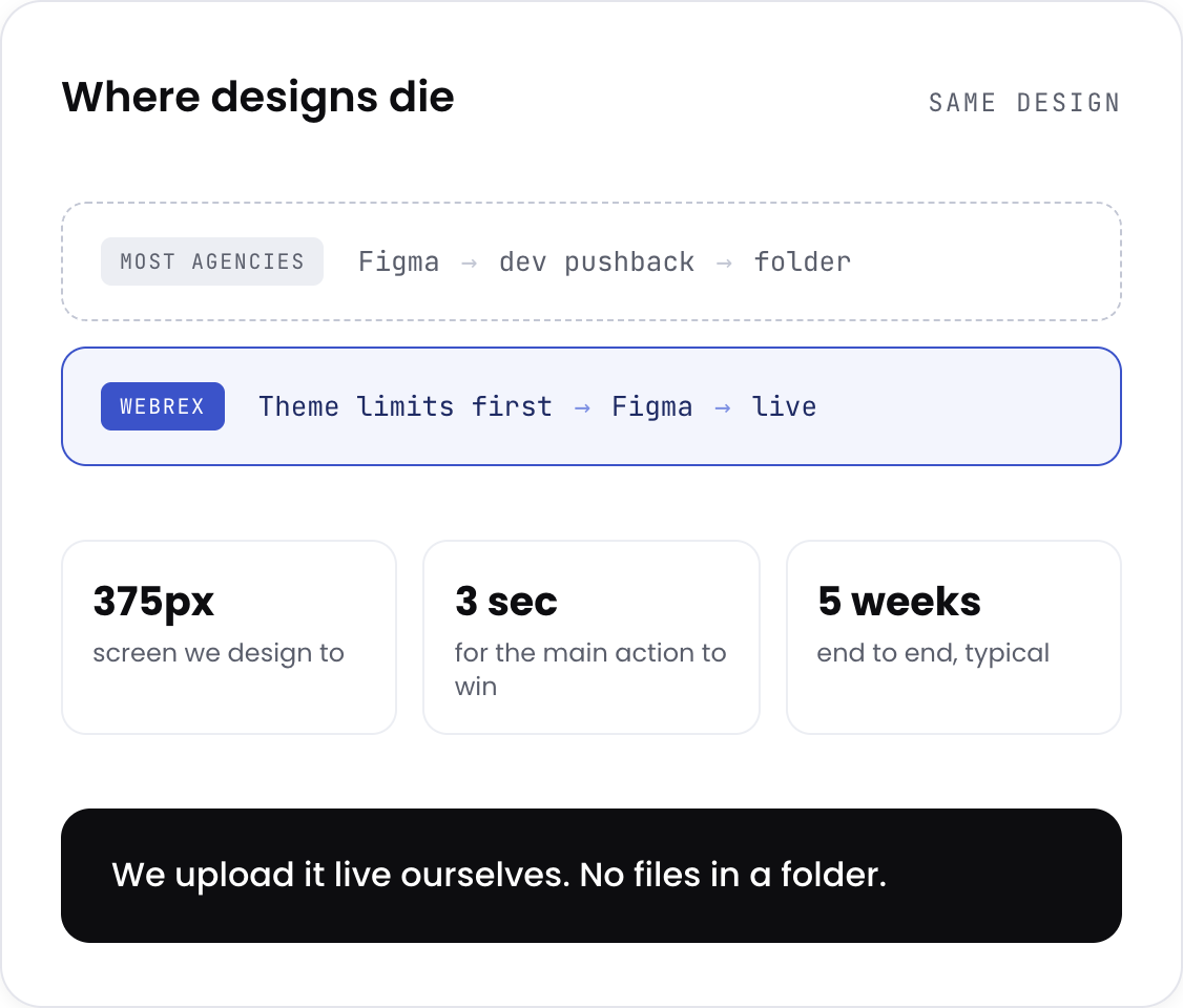
Primary action has to win attention within 3 seconds on a 375px screen. F-pattern and Z-pattern checked. If the eye lands elsewhere, the layout gets rebuilt.
Every layout, image, and banner is measured against add-to-cart rate before it ships. We design inside your theme's constraints, then upload it live. No Figma files sitting in a folder.
Shopify store design is deciding what a buyer sees, in what order, and how quickly they can act on it. Not how the store looks in a portfolio. What it does to the numbers.
The difference from a general UI/UX design agency is the constraint. A Shopify designer is working inside a theme that renders through Liquid, on a page speed budget where one uncompressed hero image costs you the sale before anyone sees the layout, in a checkout you mostly cannot touch. Most design agencies deliver a beautiful Figma file that a developer then has to argue with. We design knowing what the theme will actually allow, which is why the work ships instead of getting value-engineered down to nothing.
Primary action has to win attention within 3 seconds on a 375px screen. F-pattern and Z-pattern checked. If the eye lands elsewhere, the layout gets rebuilt.
Consistent backgrounds across every SKU, size reference overlays, lifestyle composites for hero positions, correct ratios per placement.
Theme limits, Liquid quirks, WebP export, image dimensions, Polaris compliance for app screens, all decided before design starts.
Uploaded into Shopify ourselves. Images to CDN with alt text, email templates built in Klaviyo, app UI handed over with developer specs.
Two rounds of revision per deliverable, scoped at kick-off.
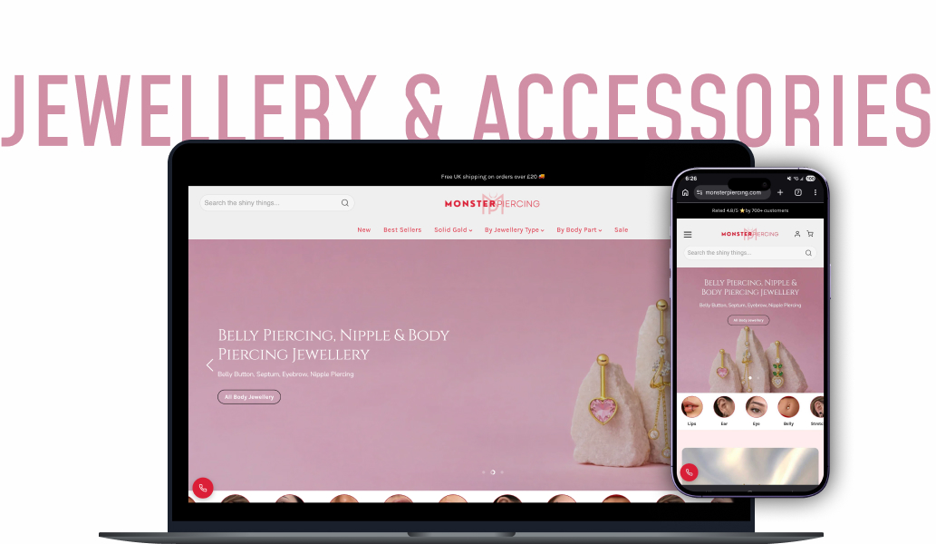
Session recordings on a UK jewellery retailer showed people zooming into product images repeatedly. They were not admiring the shot. They were trying to read the label, because nothing on the page told them the size.
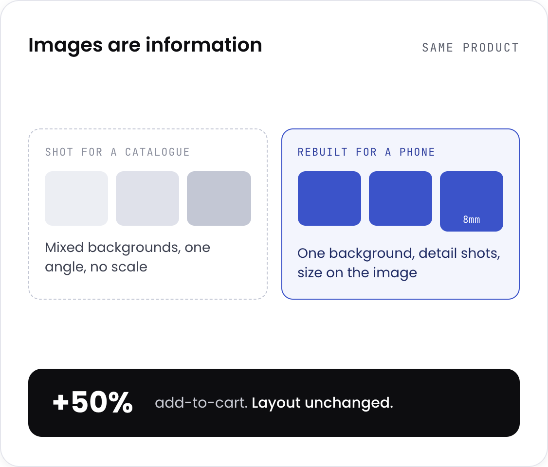
Most stores shoot every product on whatever background, assume the customer knows the scale, and show one angle per product, then judge the result on how it looks. What actually lifts add-to-cart is the opposite: one consistent background across every SKU, a size reference on the image itself, and detail shots that answer the question people are asking — judged on whether add-to-cart moved, not on how the shot looks.
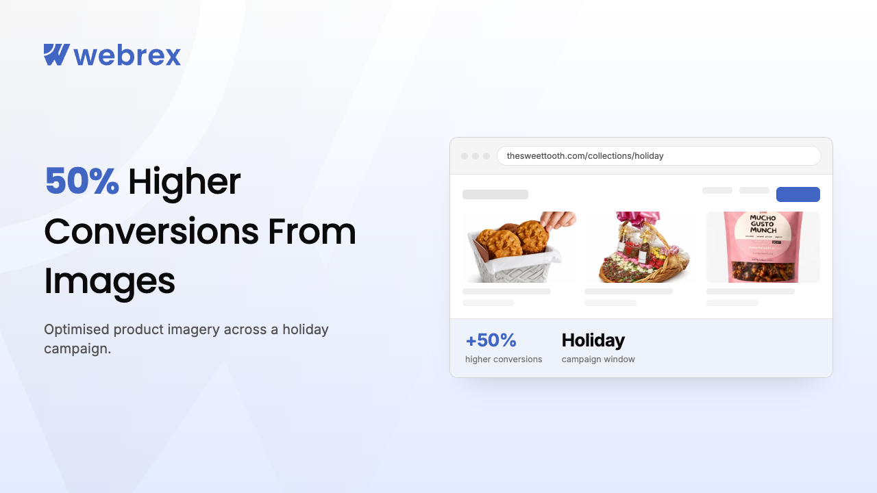
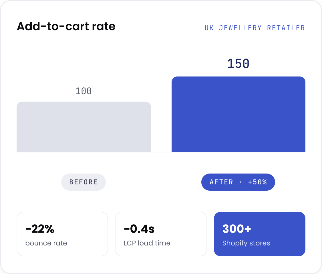
Restructuring the images on that store lifted add-to-cart 50%, dropped bounce 22%, and took 0.4 seconds off load time, because the new exports were lighter than the originals. Nothing about the page layout changed.
Webrex operates nine apps on the Shopify App Store used by over 300,000 merchants. Every one of them needed dashboards, onboarding flows, empty states, and App Store screenshots, built to Shopify's Polaris system. That work is the reason app UI is a service here at all, and it is the part almost no design agency can do.
Proof from our own app: a UI redesign on one of our SEO apps took day-7 retention up 27%, feature discovery from 34% to 61%, and install conversion up 18%.
View our appsHeatmaps, session recordings, and your existing brand assets. We work out which visual touchpoints are actually costing you money. You get a design brief and scope.
An asset priority matrix ordered by revenue impact, plus a platform constraint map so nothing gets designed that your theme cannot render.
Figma delivered in tranches by category, two revision rounds each, reviewed through Figma comments rather than email chains.
Uploaded into Shopify by us. Images to CDN with alt text, email banners built in Klaviyo, app UI handed over with annotated developer specs.
Typical timeline: 5 weeks end to end. Scope-specific work such as product pages only: 1 to 2 weeks.
Same standard applies to our own product: a UI redesign on one of our SEO apps took day-7 retention up 27%, feature discovery from 34% to 61%, and install conversion up 18%.
If you are in the second list, say so on the call. We will point you at the right page, even if it is not this one.