

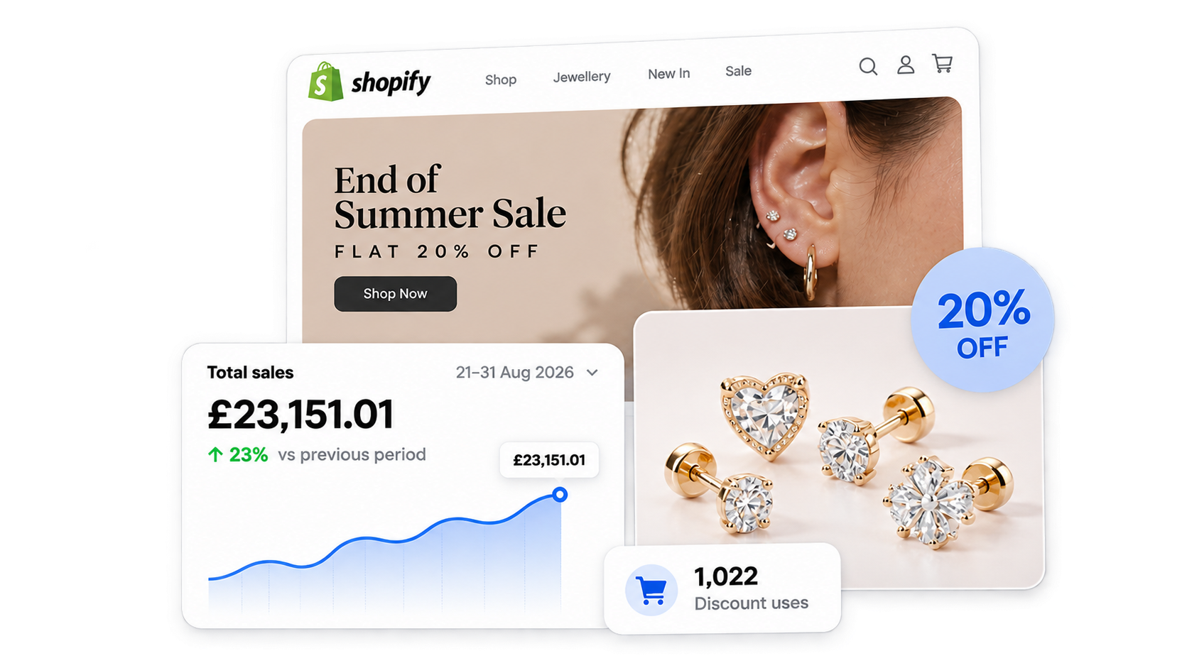
Monster Piercing is a London jewellery brand with a loyal following and products people buy on a whim. A summer sale was an easy call. The hard part is making a sale actually grow the monthly number instead of just handing a discount to people who were going to buy anyway.
So we did not treat this as a coupon and a single homepage banner. We made the 20% off show up on every step of the journey, from the top bar to the cart, and lined up the emails to land at the right moments. Here is exactly what we built and what it did.
Client: Monster Piercing, a London jewellery store on Shopify.
Work: Conversion setup, custom Shopify development, and email marketing for the End of Summer Sale.
Dates: 21 to 31 August 2026, a 10-day sale at a flat 20% off.
Planning: About 1.5 months of prep before the sale went live
The Numbers at a Glance
| What we measured | Result | Change |
|---|---|---|
| Monthly revenue (August) | £49,576.03 | up 23% vs July |
| Sale-window revenue (10 days) | £23,151.01 | 21 to 31 Aug |
| Discount | 20% off | every collection |
| Discount used | 1,022 times | in 10 days |
| Email campaigns | 4 | 1 teaser, 3 during |
| Revenue from email | £1,287.22 | last-click |
Source: Shopify Analytics and the email platform.
The Problem: A Good Offer Is Not Enough on Its Own
Monster Piercing did not have a traffic problem. The End of summer is a natural time for shoppers to treat themselves, and the brand had the list and following to reach them.
The issue is what most stores get wrong with a sale. The discount sits in one or two spots, the shoppers never feel any urgency, and the sale price doesn’t show up where people actually decide to buy: the product card, the collection grid, and the cart.
We wanted the opposite. We wanted the 20% off to be impossible to miss and the same on every page, and we wanted the emails to arrive right when the store was ready to convert.
This took about 1.5 months to plan, design, build, and test before day one.
Part 1: Custom Theme Design That Sold the Sale on Every Page
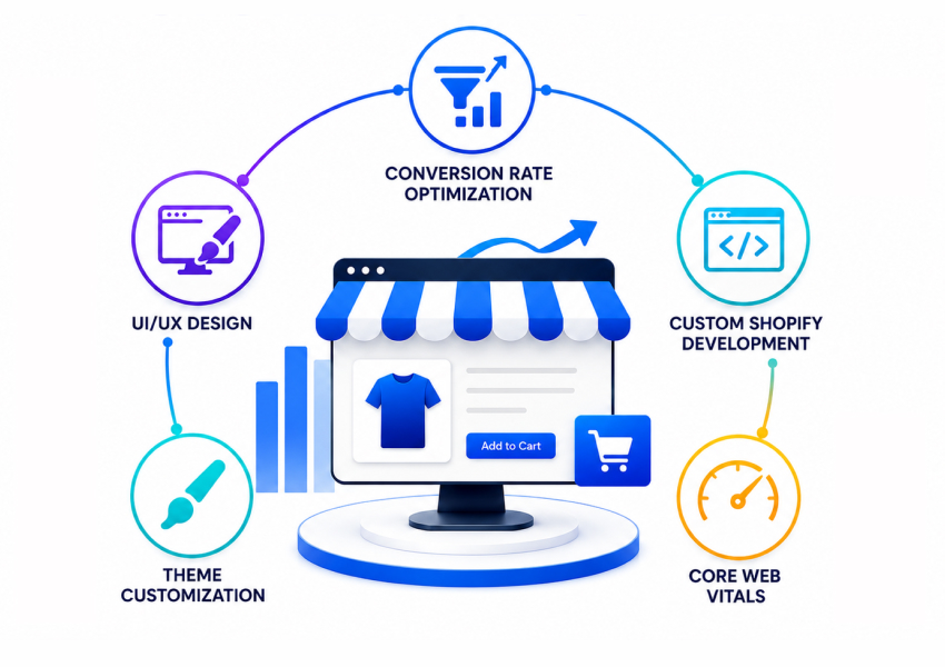
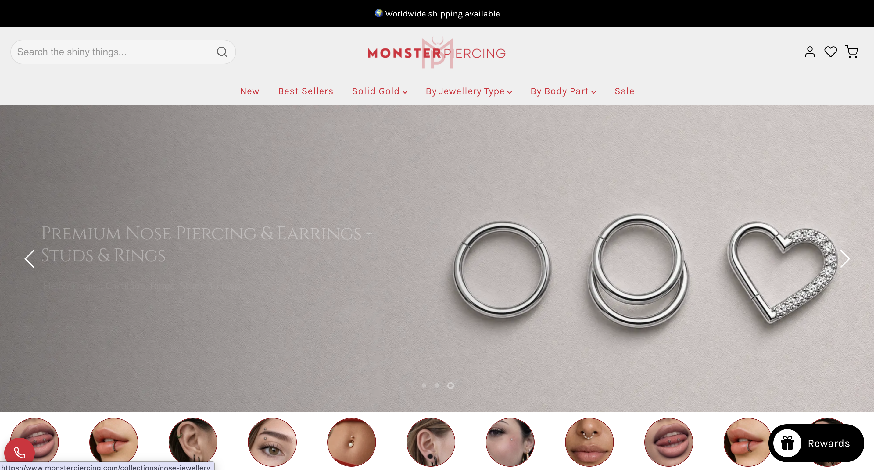
The campaign relied on Shopify theme customization to carry the offer across the homepage, product pages, collection grid and cart. The offer had to be visible from the first scroll, on every page, not just the homepage. We showed the old price and the new sale price side by side everywhere so people could see the savings without doing any math.
The Announcement Bar Kept the Offer in View
A rolling “End of Summer Sale, Flat 20% Off” bar sat at the top of every page for the whole 10 days. A Shopify announcement bar like this is a simple thing, but it means the offer never drops out of sight no matter where someone lands.
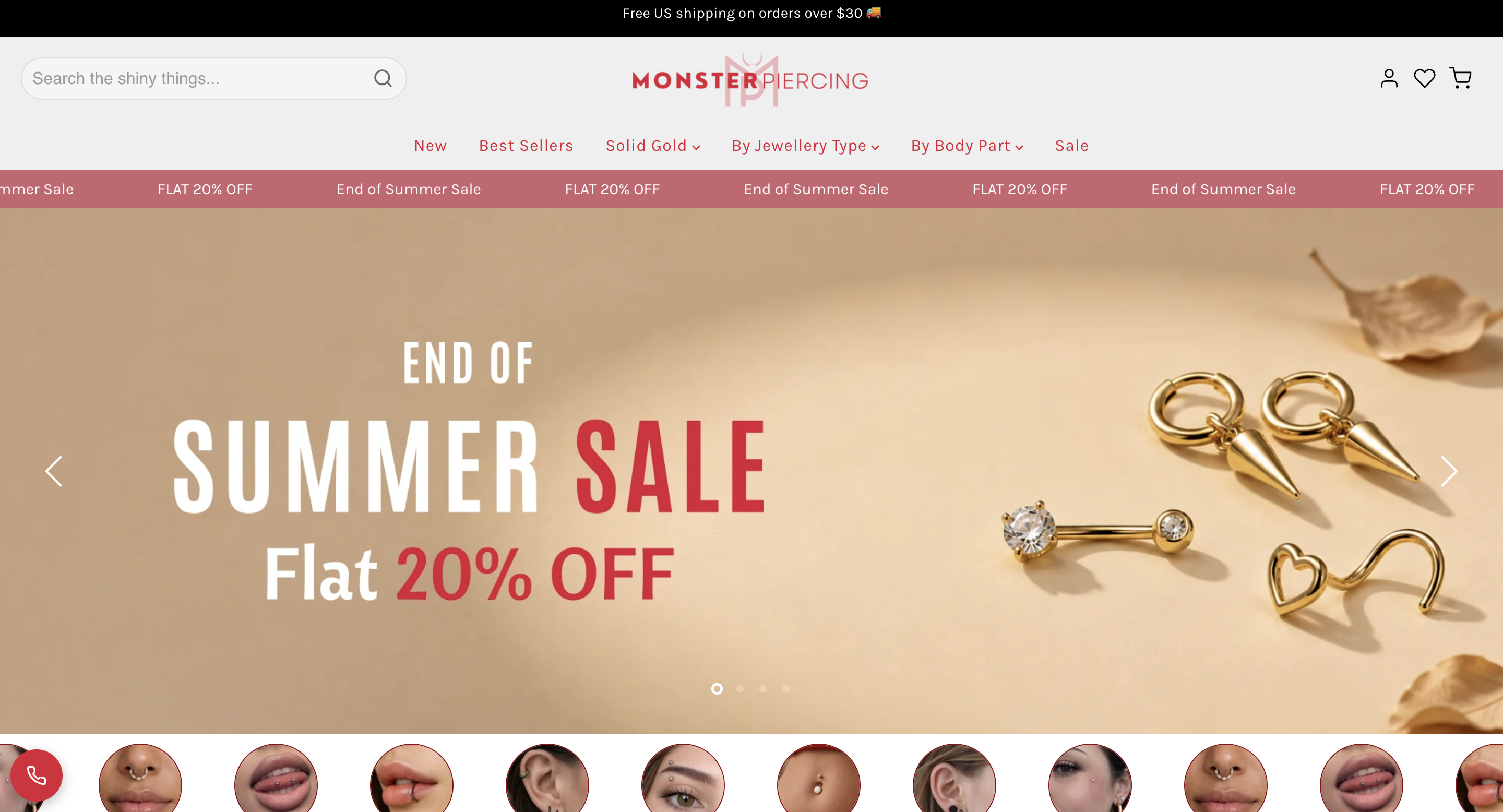
The Homepage Banner Was Built for the Sale
We designed a fresh “End of Summer Sale, Flat 20% Off” homepage banner just for this campaign, not a recycled graphic. It set the tone the moment the page loaded.
The Product Page Showed the Savings and a Countdown
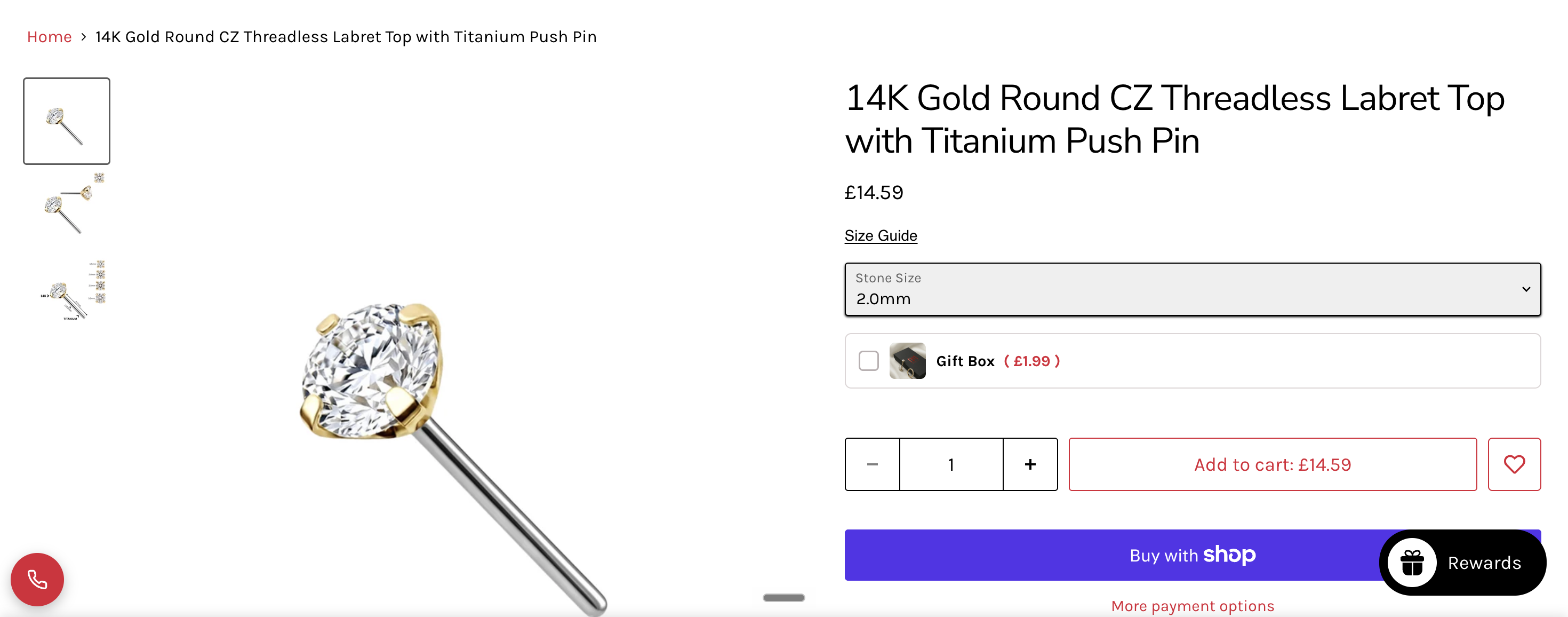
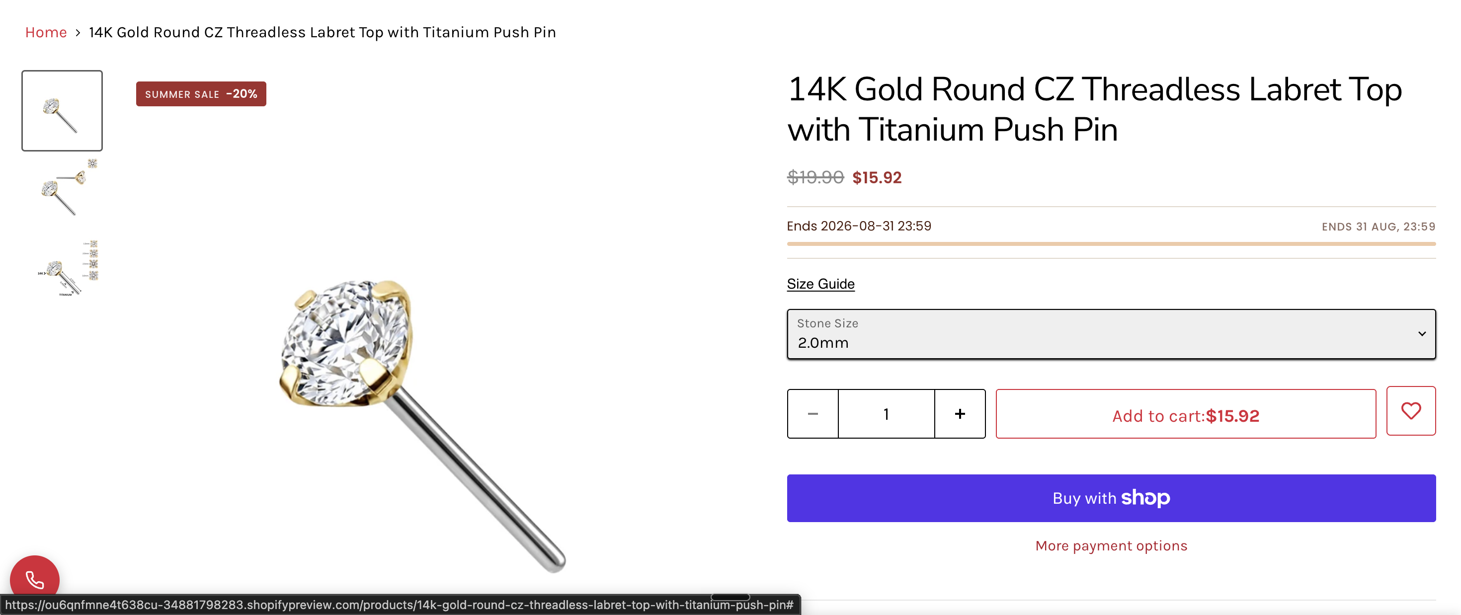
On each product, we showed the original price crossed out next to the sale price, plus a countdown timer running to the sale end at 31 August, 23:59. A Shopify countdown timer on the page where people decide gives them a clear reason to buy now instead of later.
The Collection Page Carried the Sale Too
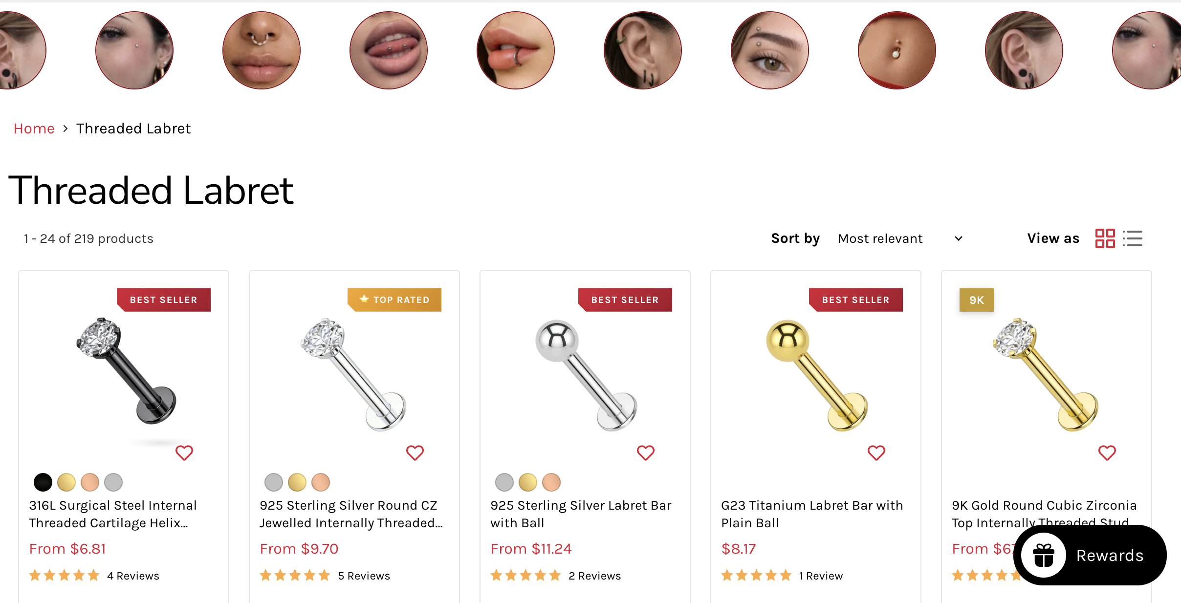
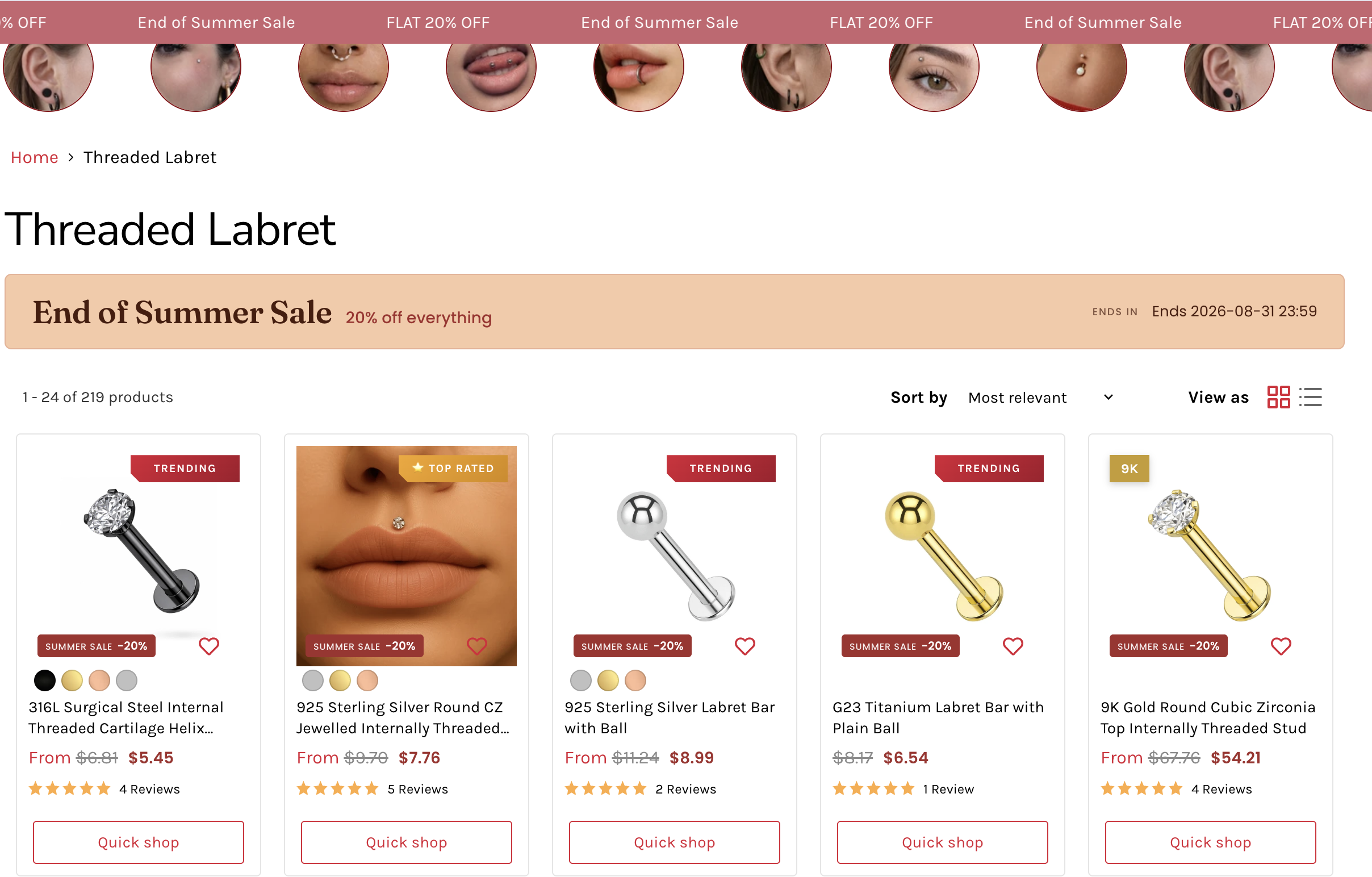
We did not stop at the product page. The whole collection grid got a “Summer Sale” badge, the old price next to the sale price on every card, and a countdown, so people felt the deal and the deadline while they were still browsing.
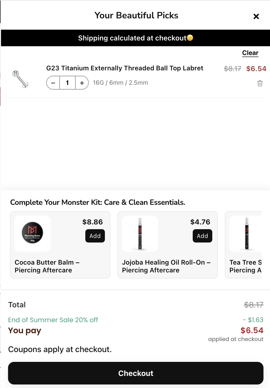
The Cart Showed the Discount Already Applied
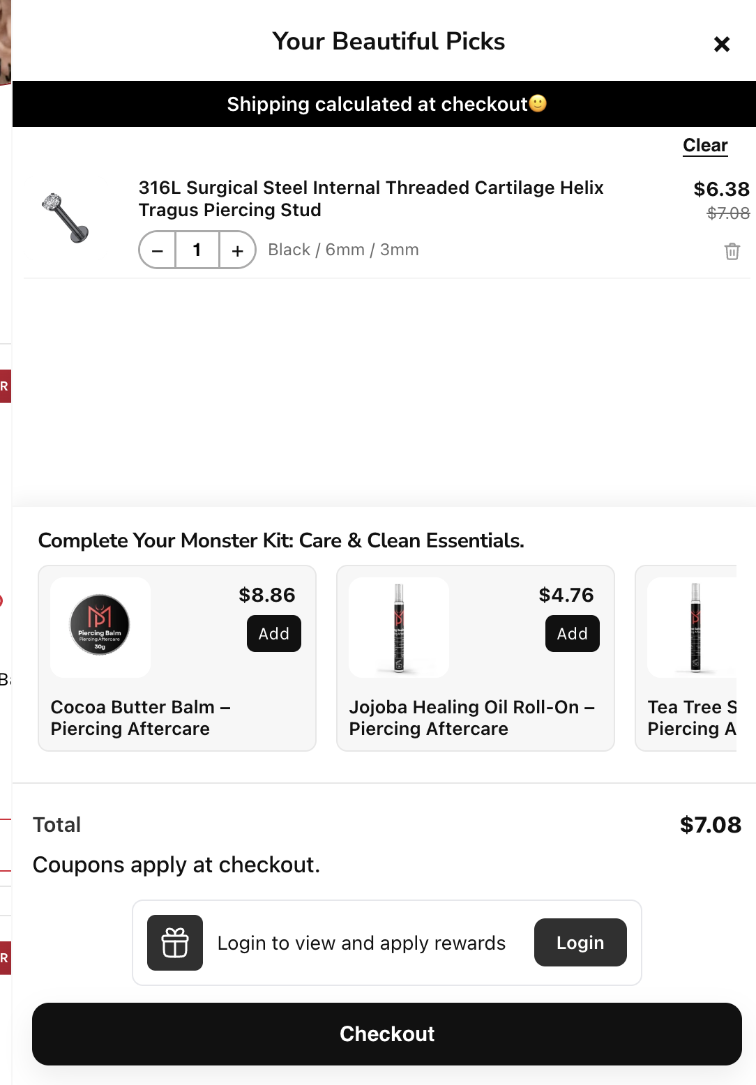
In the cart drawer, we showed the discount live: the original price, the amount coming off, and the final “you pay” figure. That small thing removes the last worry a shopper has, which is “did my discount actually work?” They could see it was already there before they even reached checkout.
Part 2: Shopify Conversion Rate Optimization Behind Every Change
Every design choice above was really a conversion choice. The point of Shopify conversion rate optimization is to remove doubt, show value early, and give people a reason to act. Here is how each piece did that:
- The sale price showed up while browsing: not just on the product page, so the decision started on the collection grid.
- The old-versus-new price was everywhere, so the value was obvious and nobody had to work it out.
- The countdown timers turned “maybe later” into “buy today.”
- The live discount in the cart killed the last-second doubt about whether the deal applied using Shopify automatic discounts.
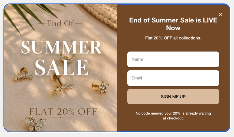
- A pop-up announced “End of Summer Sale is LIVE Now, Flat 20% Off all collections” with “No code needed, your 20% is already waiting at checkout.” That grabbed new subscribers and took away the friction of hunting for a Shopify discount code.
Stacking these is what made the same traffic convert harder. Over 10 days, the discount was used 1,022 times.
Part 3: Shopify Email Marketing Timed Around the Sale
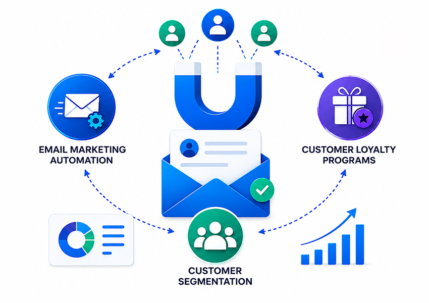
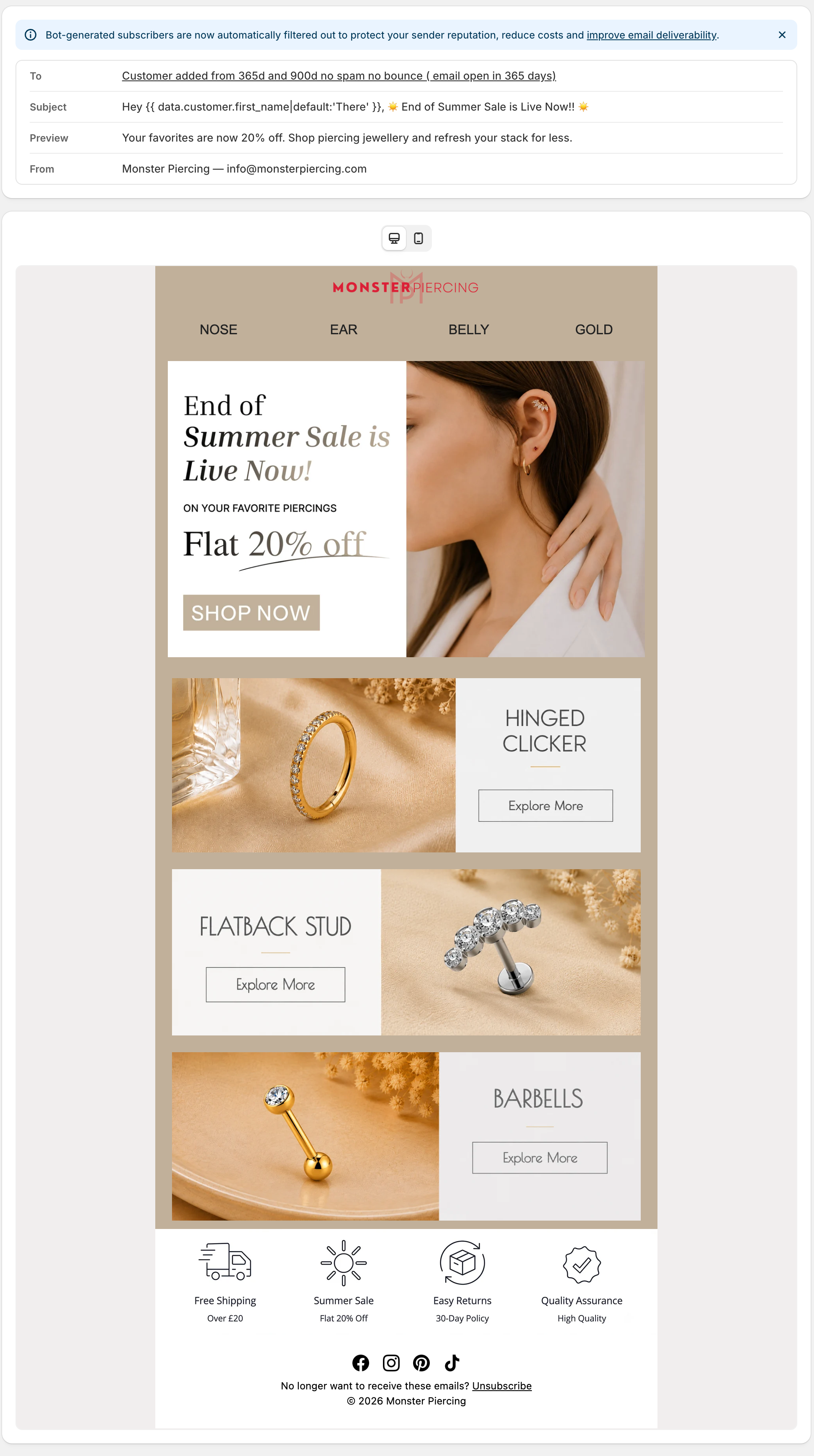
We ran 4 email campaigns, timed so the list showed up when the store was ready for them. The Shopify email marketing strategy was executed to create Shopify email marketing campaigns at key moments:
- 1 teaser before the sale: A simple heads-up that the sale was coming, to warm the list.
- 3 emails during the sale: A launch email, a mid-sale reminder, and a final “ends tonight” email as the countdown ran down.
- Matching design: The email banner looked exactly like the on-site banner and the pop-up, so people saw the same offer and the same look in their inbox and on the store.
Email brought in £1,287.22 in directly tracked sales.
A quick honest note on the email number. The £1,287.22 is only the last-click revenue, meaning the sales where email was the final touch before buying. Email’s bigger job here was timing and reach. It brought the list back to a store that was fully set up to convert, and last-click never gives that its full credit. The design and conversion work is what turned those visits into the £23,151 sale total.
The Result: Monthly Revenue Up 23%
August finished at £49,576.03 in total sales, up 23% from July. It was the store’s strongest month, and the 10-day sale drove it.
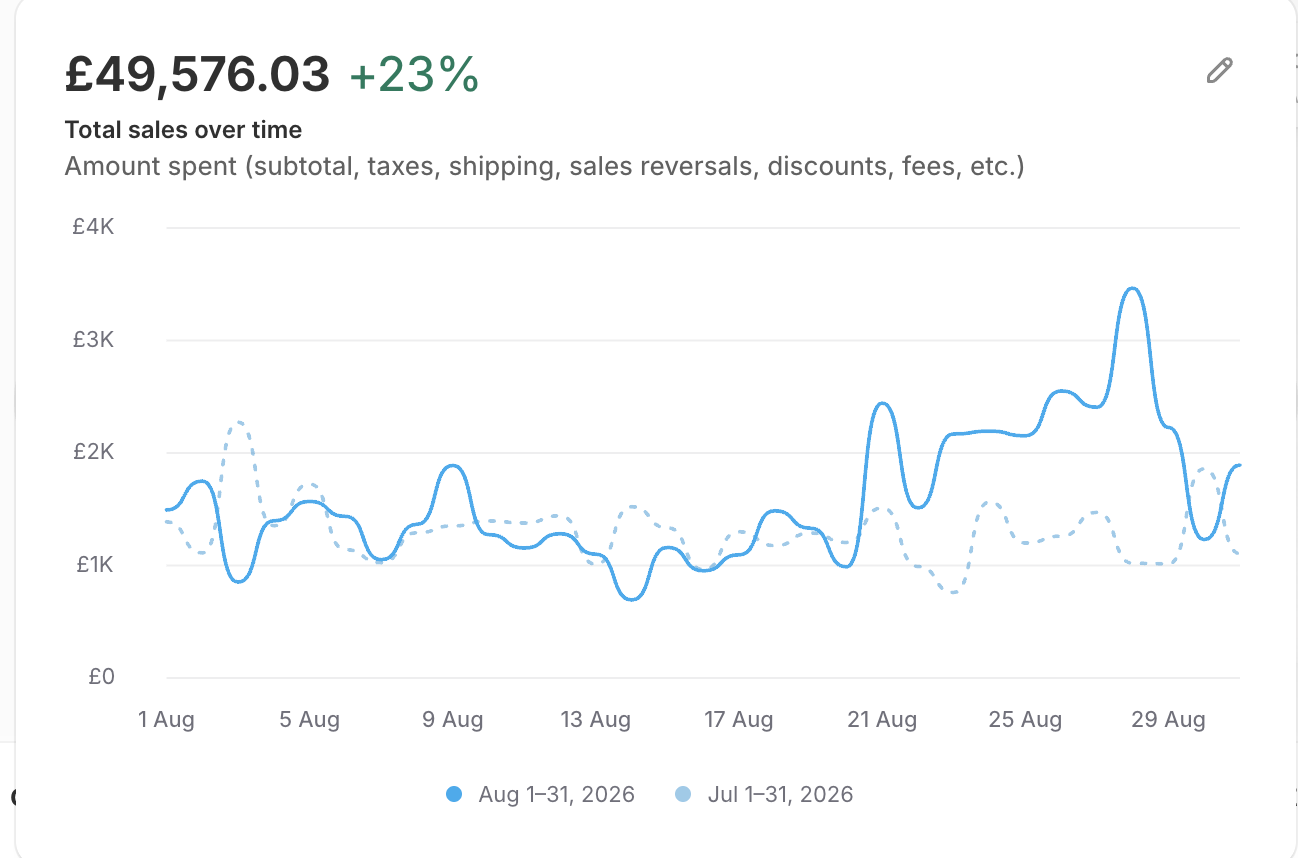
Source: Shopify Analytics, August versus July 2026.
Breaking it down:
- £23,151.01 came straight from the 10-day sale (21 to 31 August). You can see the clear jump in the graph from 21 August on.
- The 1,022 discount uses show the 20% off pulled in real orders, not just discounts on sales that would have happened anyway.
- The growth came from more people buying, because the offer was clear and consistent from the top bar all the way to the cart.
That is the gap between putting up a banner and running a sale as one connected system across the design, the conversion setup, and the emails.
You can also read our other related campaigns for this client, like the Monster Piercing Spring Sale case study and our Klaviyo to Shopify Email case study.
The Takeaway
Monster Piercing did not need a bigger discount or a new product. They needed the whole store to sell the sale.
The same 20% off showed up in the announcement bar, the homepage banner, every product card, the collection grid, the countdowns, the pop-up, the cart, and the inbox, all saying the same thing at the same time. That is what turned a seasonal discount into a 23% lift in monthly revenue and a £23,151 sale window.
Most stores run a sale from a single banner. The revenue is in making every page carry it. This case study demonstrates how strong Shopify CRO coupled with Shopify email marketing builds momentum.
About 1.5 months of planning. 10 days live. Design, conversion, and email, all pulling together.
Contributed by: